The First Cut on the Contact Sheet
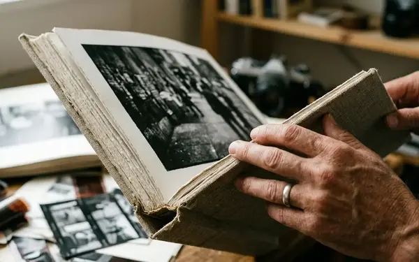
A curator stands over a light table with a red grease pencil in hand. Silver gelatin contact sheets cover the surface, each row carrying a few more seconds from a recent conflict zone. The search slows at a face almost lost in the commotion: one brief expression that gives the surrounding frames their emotional weight.
That frame may have looked unremarkable to the photographer while the shutter was firing. On the contact sheet, it holds the beginning of an exhibition. Several technically cleaner photographs sit nearby, yet their subjects remain distant. A sharp image can record a barricade perfectly and leave a visitor with little sense of the people living beside it.
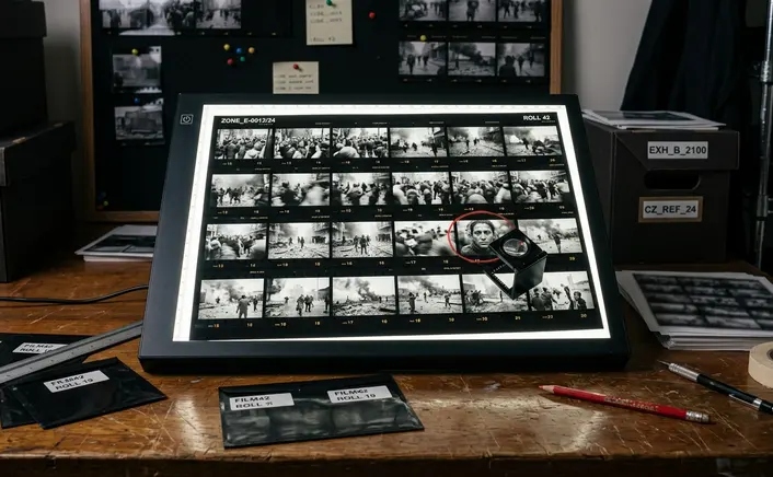
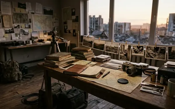
Field coverage produces far more material than a gallery can place on its walls. The first pass therefore asks a narrow question: which photograph gives a visitor a way into the story? I mark that frame, then look outward. What happened just before it? Which adjacent images supply the place, the people and the consequences that the anchor image cannot explain alone?
This is the curator's central bridge. The photographer brings the lived pace of the field; visitors arrive without that experience. The edit must carry enough of the photographer's understanding across the gap while letting the people pictured remain more than evidence for a prewritten argument.
What Survives the Second Edit
The difficult cuts come after the obvious rejects are gone. At that point, every remaining photograph has a plausible claim on the wall. The photographer remembers the risk taken to make one exposure, the long wait behind another, the person who agreed to be photographed. Those memories matter to the project, though a visitor cannot see them in the print.
I separate those memories from what the image communicates. First, I assess its composition: can the eye find the subject without struggling through incidental detail? Next comes emotional resonance, which may live in a gesture rather than a dramatic event. Last is narrative utility. Does this frame advance the account, complicate it or give viewers a needed pause?
Barricades or a person seeking cover
Consider a shortlist weighted toward high-contrast photographs of urban barricades. Their lines are strong, and together they establish a setting. Hung in succession, though, they can turn a conflict into an exercise in geometry. A slightly motion-blurred frame of a civilian seeking cover may carry more of the event's human urgency. Keep the barricade image that locates the scene; give the civilian frame room to breathe.
The decision is editorial, not a prize for technical imperfection. Blur serves this sequence because it belongs to a specific moment of movement and fear. In another frame, it might simply obscure the subject. Killing a favourite photograph becomes easier when the question shifts from how hard it was to make to what it can do beside the other prints.
How Photographs Speak Across a Wall
Two photographs change meaning when they share a wall. A wide view of a damaged landscape can make a nearby portrait feel situated rather than isolated. Reverse their order and the portrait may become an introduction to a place the visitor has yet to see. Sequencing works through these small acts of anticipation and recognition.
I map that exchange before fixing the final positions. A large establishing print asks viewers to take in the scale of a place. A cluster of intimate portraits asks them to step closer and spend time with individual faces. Details can interrupt both: a hand, a doorway or an object left in a room gives the eye somewhere quieter to settle. Alternating those distances changes the visitor's posture as well as the visual rhythm.
Look for repetition with a purpose. Similar angles can build pressure when each image adds information; they cause fatigue when they merely restate the same damage. A pause between difficult photographs can come from ordinary life within the same community, provided that image belongs to the story rather than offering easy relief.
A gallery sequence makes a focused, navigable thesis about a cultural conflict. It cannot contain the conflict's entire history. That limit should shape the edit: leave room for unresolved questions, and avoid arranging the final wall as though the last image settles what happened. The sequence owes viewers a legible route through the work, and subjects deserve more complexity than a tidy ending would allow.
Captions That Carry Their Share
A portrait can hold a visitor's attention before its caption is read. The text then has a precise job: identify what can be established about the person, place and event without instructing the visitor what to feel.
For a sensitive portrait, I begin by removing emotive adjectives from the draft. If the location and date are known, I state them accurately. If the circumstances of the photograph matter to its interpretation, I explain those circumstances in plain language. A caption should give the image historical footing, not borrow the authority of the subject's expression to make claims the photograph cannot support.
Keep the context specific
Introductory wall text can carry the background that individual captions would otherwise repeat: the project’s scope, the events pictured and the limits of the selection. Captions can then stay close to their photographs. This division also helps visitors who enter midway through a room; they can understand a print without needing to read an essay first.
Pay close attention to images of trauma. A dramatic photograph may draw people across the gallery, but its prominence can strip an event of its geographical and political reality if the surrounding sequence offers no context. Ask whose account is being foregrounded, what remains outside the frame and whether the caption identifies the subject with the care given to the photographer. Dignity is an editing decision made in the image, the words and their placement together.
The Route Through the Room
Before the prints go up, walk the empty gallery. From the entrance, note what the visitor will see at once, what a partition conceals and where someone can stop without blocking the path. A sequence that reads well on a table may deliver its hardest image too early when translated onto facing walls.
Place a harrowing photograph behind a temporary partition if it needs context before the encounter. Visitors can then pass through the establishing images, meet the people at the centre of the work and arrive at that photograph with some understanding of its place in the story. The partition controls pacing; it does not soften the evidence.
Lighting and sightlines carry the same editorial responsibility. Check for glare where a visitor must stand to read a dark print. Keep nearby captions close enough to their images that no one has to guess which account belongs to which person. Walk the room again at the pace of a visitor, stopping where the layout invites a closer look. The exhibition is complete only when its physical route makes the intended sequence possible.
The scale of that responsibility was clear in Edward Steichen's 1955 Museum of Modern Art exhibition The Family of Man: from more than 2 million submitted photographs, the final exhibition held 503 prints, a selection rate of about 0.025%.